
Singer Tate McRae has released a teaser for her new single Housewife, and while the moody superyacht setting has sparked fan theories, there’s one detail the designers can’t ignore. The police.
Featuring one of the most iconic fonts of all time, the design surprised creatives with its unexpected appearance on the single’s branding. But while some clutch their metaphorical pearls, others see the controversial font choice as a return to form for the world of pop music design.
So what typographical sin did old Tate commit? She used a super light Helvetica font. I know, the horror.
Latest videos fromCreative block
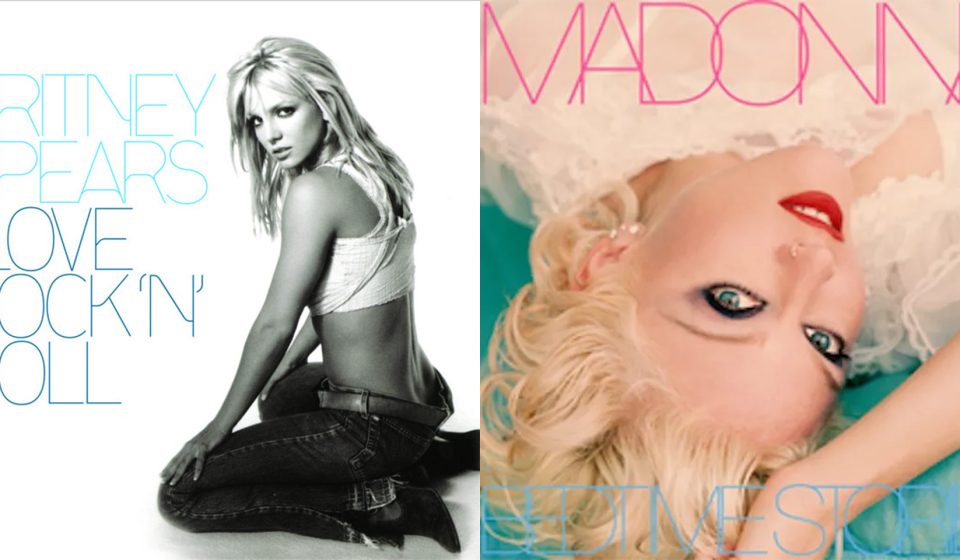
“She will pay for her crimes,” one X user wrote, while another joked: “It’s grotesque, honestly.” While one reviewer claimed that “Tate McRae has NO REASON to use a super light Helvetica font,” others referenced album covers from the early 2000s, like Britney’s I Love Rock ‘N’ Roll and Madonna’s Bedtime Stories. Do you remember it? Exactly…this is why we don’t use ultra-light Helvetica, folks.

For more music news, find out why the cover of Kpop group IVE’s new album was so disturbing or take a look at Phoebe Bridgers’ ‘No Internet’ album campaign.
Gn entert