
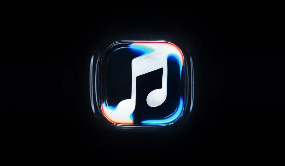

This should pair well with the Liquid Glass design language.
Apple just revealed a pretty unique design language and logo for Apple Music. It looks like a musical note floating beneath undulating waves, which should combine well with the Liquid Glass software interface.
The company claims it was made through practical effects by engraving the logo on the glass bottom of a small tank. This tank was then filled with mineral oil and a transparent cover was placed over the logo. Then Apple used an instrument to play a short series of tones, causing the oil to ripple. They filmed everything and here we are.
This project was a collaboration between Apple, music producer Fred Again, and a company called NEST Acoustics. “For the Apple Music rebrand, we wanted the sound to create the visuals,” a narrator explains in an introductory video. “How can we take this idea of music and distill it into something visually beautiful? Essentially, the idea was to create the perfect sound wave.”
Apple updated the Apple Music app icon to beta 4 pic.twitter.com/hcx1fknpGr
– Andreas Storm (@avstorm) October 13, 2026
The motion-filled waving logo will be used at the start of Apple Music videos and elements such as concert footage. The actual app icon changes from red to black and white, which hasn’t been a hit with internet users. All of these changes will arrive with the company’s upcoming software releases, including iOS 27.2 and macOS 27.2.
Gn tech