
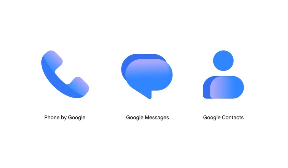

Following the redesign of the Workspace and Pixel apps earlier this year, Google is revamping the Contacts, Messages, and Phone icons.
Google says “icons look sharper and clearer” on home screens thanks to a “subtle but clean gradient with easily readable edges.”
The general shapes of Google’s communications apps remain unchanged, but the redesign brings “updated curvature and coloring to align with the rest of the Google apps you know and love.”
Current

This change will be rolled out in the coming weeks via the Play Store and is already live with the latest Google Messages beta this morning. Google emphasizes that there are no functional changes with this update.
Don’t worry, the functionality of these apps does not change because of the new icons. You’ll just notice a sleeker, more consistent look on your Home screen in the coming weeks.
The new icons should also appear on contacts.google.com and messages.google.com/web.


FTC: We use automatic, revenue-generating affiliate links. More.
Gn tech